®2025
Work
about
A premium digital experience for a market leading daily health drink, AG1
A software solution designed to streamline the process of generating creative briefs and entire campaigns within tight deadlines.
This project was possible through the partnership between Dentsu International and Adobe.
Year
2021
Roles
Product Designer
Product Manager

What's Content at Scale?
Content at Scale is a one-stop solution designed to empower creative teams and streamline the process of generating creative briefs and executing entire campaigns efficiently within tight deadlines. With its interface and robust features, Content at Scale revolutionizes the way creative projects are planned, managed, and delivered.
This solution was designed through the robust partnership between Dentsu International and Adobe.
Task Overview
Content at Scale facilitates seamless collaboration among team members, allowing them to work together in real-time on briefs and campaigns.
Task Overview
Content at Scale facilitates seamless collaboration among team members, allowing them to work together in real-time on briefs and campaigns.
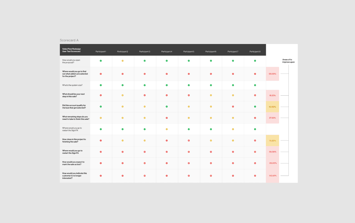
Usability testing: Round 1
First of all, we needed to test our initial assumptions to see what is working well with the app currently, and where to improve upon when we do a full redesign. For this, my PM and I tested the current sales flow with a scorecard test. In short, the primitive sales flow did not test well.
Value / Effort prioritization
Of the assumptions we tested, we discovered many areas to improve upon. However, we had to follow our roadmap, and had to decide what would be the most valuable changes for the user, given the least amount of effort from our engineers.
The items in blue are what we could focus on for our MVP, items in grey were a bit out of scope.
White boarding
After we prioritized our items to improve upon, I got to drawing out the shared vision of my product manager and I. Here are some of the white boarding sessions we had before I made our ideas digital.
Iteration 2
Based on user feedback, the sales progress was not straight forward We opted to include a radial wheel to enhance gamification and added a UI for users to select where in they are in the sales process.
Usability testing: Round 2
First of all, we needed to test our initial assumptions to see what is working well with the app currently, and where to improve upon when we do a full redesign. For this, my PM and I tested the current sales flow with a scorecard test. In short, the primitive sales flow did not test well.
Iteration 3
After continued user testing, we got to a more refined solution to address missing functionality outline by the sales reps.
The
Solution
After final rounds of testing and more iteration, we finally got to the solution optimized for desktop, tablet and mobile.
Outcomes
The last thing to do was verify that our solution met the expectations of the product team, stakeholders, and most importantly the user. We are so excited that this sales flow redesign is reducing friction for sales reps during the sales process.
Key takeaways
My Product Manager and I acknowledged that the company was missing out on an estimated $150 million annually due to an incomplete sales tool. In short, sales reps would frequently lose deals due to complications related to the sales tool (or lack thereof) that they used. An inefficient and incomplete sales tool led to a missed opportunity for substantial revenue gains.